No products
Categories
- Fashion Accessories
- Clothing
- Beauty & Lifestyle
-
Hi-Tech & Lifestyle
- Gaming
-
Case
- iPhone 11 Pro
- iPhone 11 Pro Max
- iPhone 11
- iPhone X / XS
- iPhone XS Max
- Samsung S10 / S10+ / S10e
- Huawei P30 / P30 Pro / P30 Lite
- Huawei P20 / P20 Pro / P20 Lite
- iPhone XR
- Samsung S9
- Samsung S9+
- iPhone 8 / 7
- iPhone 8 Plus / 7 Plus
- Samsung S8
- Samsung S8+
- Samsung S7
- Samsung S7 Edge
- iPhone 6 / 6 s
- iPhone 6 Plus / 6 s Plus
- iPhone 5 / SE
- Skin
- Audio
- Smart Home
- Drones & Hoverboard
- Photo & Video
- Desk Supplies
- Accessories
- Games
- Beverages
- Food
- Home
- Jewelry
- Luxury
- Travel
- Art
- Footwear
- Vintage Fashion
- Restaurants
- Sport
- Animals
- Gift Ideas
- Kidswear
Extra


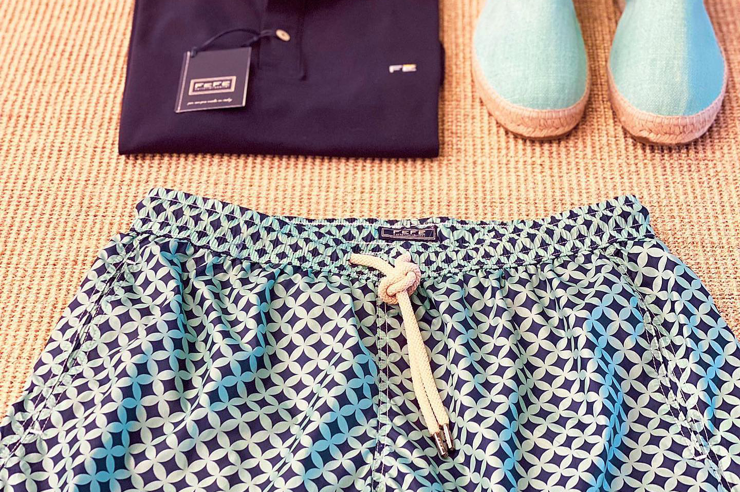
Fefè Napoli
Sartorial is Better
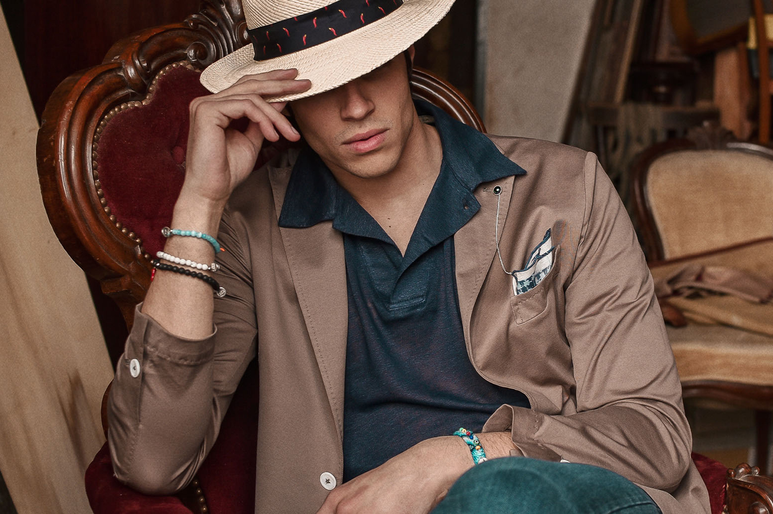
When you wear a tailored garment, it will be the garment itself that will be able to adapt to your body.
History of Neapolitan Tailoring
Birth
Fefè was born in Naples in 2011 from an idea of Francesco Fossari and Serena Femiano, respectively lawyer and architect designer but with a common and boundless love for fashion, made in Italy and the excellence of Neapolitan tailoring. Francesco and Serena look at the market almost as a challenge and see the possibility of inserting an extremely simple but at the same time incredibly sophisticated product in the context of fashion: pocket squares of classic tradition but revisited in a modern key, revolutionized in style, in presentation, in essence.
Values
The exclusive prints, the essential centrality of a strictly Italian and artisan production, the use of only noble fabrics constitute the foundations on which the company and the ideals of its founders were based from the beginning. , the pulsating attention to every detail and customer requests have allowed the Neapolitan brand in a very short time to be distributed today in about 40 countries around the world, with over 500 retailers and with an online shop active since 2012 and with shipments to every corner. of the globe.
Sartorial is Better
Sartorial is better is the title of an advertising campaign of the brand, so loved by the founders that it became part of the brand in 2017.Literally it means: "tailoring is better" and in fact you just need to try a tailored garment, a garment born from hands of skilled craftsmen, to understand the substantial difference that exists compared to a product entirely conceived by a machine - typical of fast fashion.
The hand steps of a jacket, a shirt, a bathing suit or a sock, give the garment another fit, a comfort, a softness in the stitching that an industrial garment can never have. " When you wear a garment made entirely by machine, your body has to adapt, while when you wear a tailored garment it will be the garment itself that will be able to adapt to your body ".
Francesco Fossari - Co-Founder of Fefè - Forever Made in Italy

Made in Italy is not only a fixed point for Fefè but a boundless love, a philosophy of life that is the result of a centuries-old tradition, of an indelible passion for craftsmanship.The entire production cycle is born and ends in Italy and more particularly in Naples, where tailoring is almost a reason for living, a mission to be shared, a constant search for perfection mixed with a note of imperfection that only manual work can give. in a perfect balance between tradition and innovation, modernity and quality.
Tradition - Innovation - Italian Style - Fefè Worldwide

We are between the late 1800s and early 1900s. Naples is teeming with noblemen who flaunt elegance, refinement, good taste - the famous Neapolitan gaga -; the tailors and fabric merchants become their second homes. They talk about politics (monarchy or republic), about the developing economy, about women, about life and they usually call each other with a thousand nicknames and / or nicknames, among these the most widespread is Fefè.
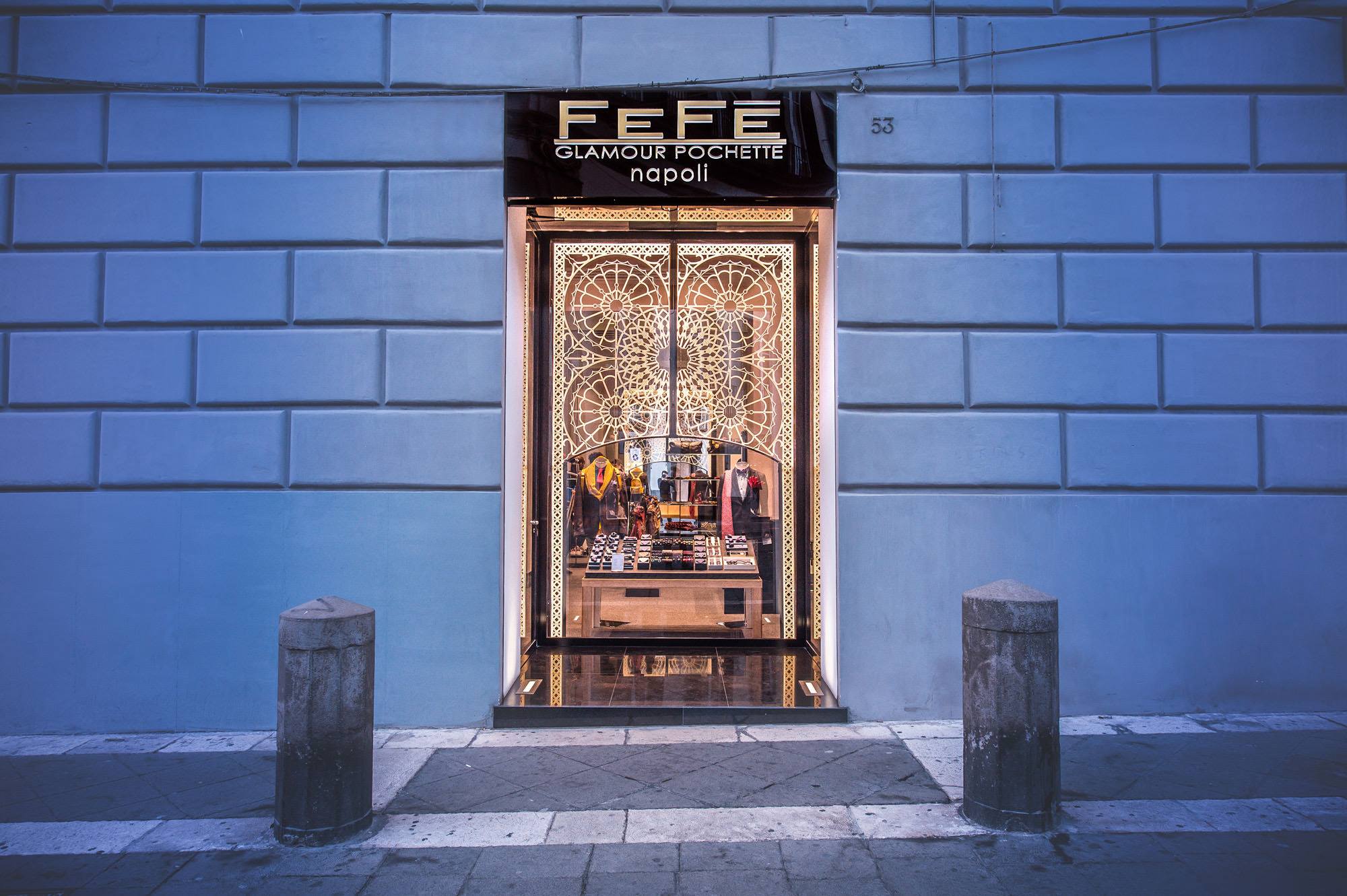
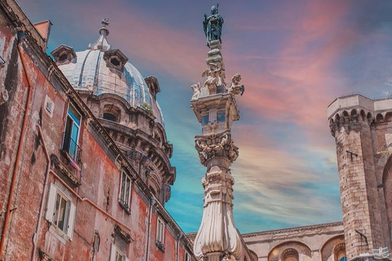
Piazza dei Martiri, 53

In the heart of Neapolitan elegance and tailoring, in Piazza dei Martiri, Naples, the first Fefè store opens.
Stories of Neapolitan Fashion and Culture
A Timeless Classic
The ancestor of the present tie was a strip of cloth of various colors worn by the Roman legionaries. Its practical function was to protect the respiratory tract during the marches, in fact, especially the rearguard groups or those following the baggage or cavalry were afflicted by continuous clouds of dust raised by the often unpaved terrain. Like all fashion ornaments it begins with a specific function in everyday life but then over time it loses its functional aspect and gains ground in its ornamental role, acquiring beauty, color, preciousness. The origin of the Italian name is much discussed but it seems that it has a link with the Croatian soldiers who used it in their uniform in the 30 years war, arousing curiosity in the Italian people who obviously did not know what to call it. Today it is an object that cannot be ignored by those who want to be truly impeccable in terms of elegance and protocol. The width can vary between 4 and 9 cm, the length is always around one meter and fifty but the fabric must mainly be of the purest silk.
Curiosities About The Tie

An Italian senator cannot enter the Senate without a tie. To challenge this rule, Senator Speroni wore the most unthinkable ties: with drawings of pigs, leather Texan and so on. In the late 1990s, Thomas FinkeYong Mao, two researchers from Cambridge University's Cavendish Laboratory, demonstrated through mathematical models that there are exactly 85 possible knots for a conventional tie. In this way, new nodes were also discovered, one of which was renamed the "Fink node". The sale of ties has decreased particularly over the years. Once it was practically impossible to go to work without a tie, today it is used only by certain categories or in particularly elegant events.
An Indispensable Accessory for The Contemporary Gentleman
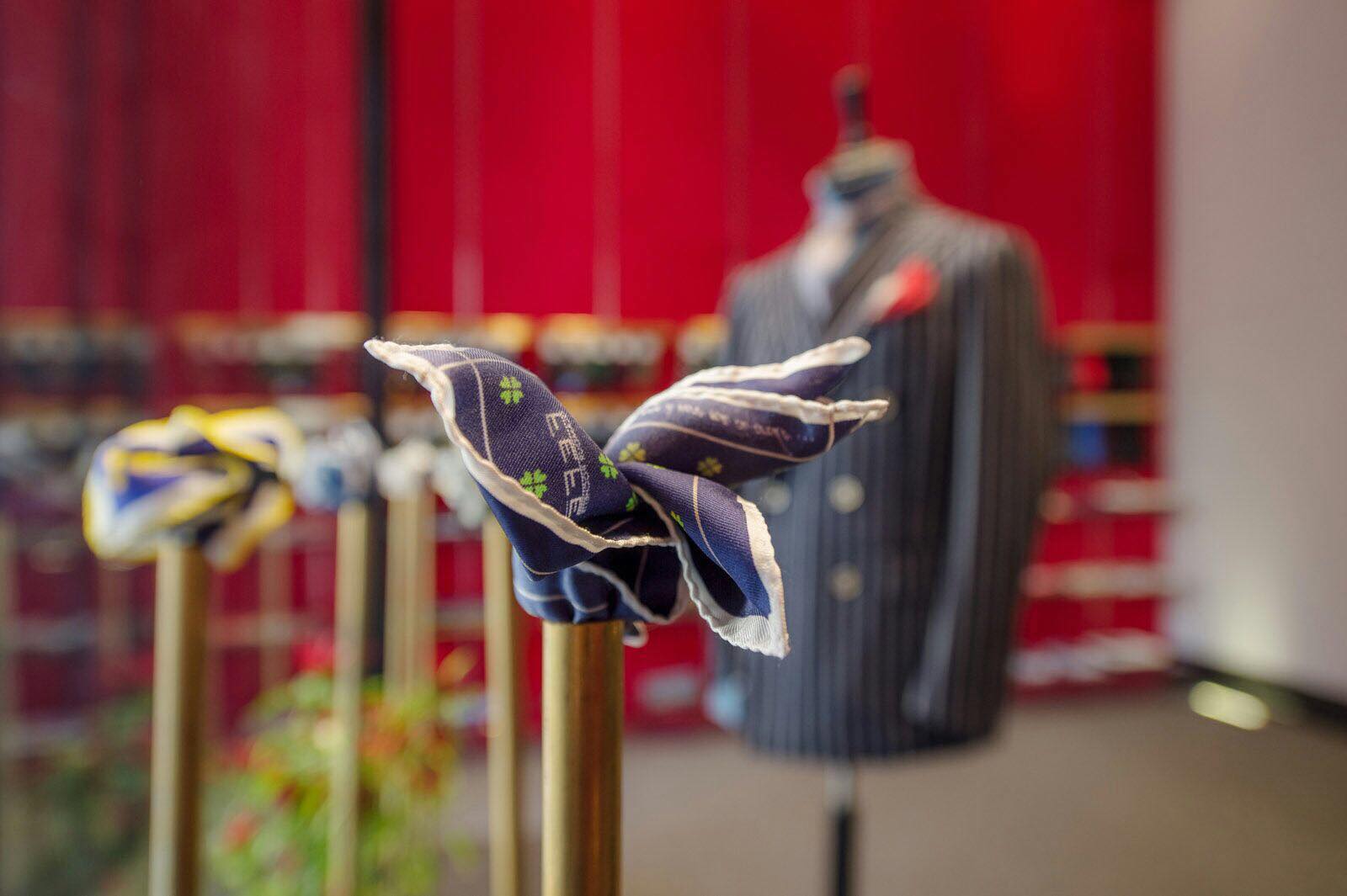
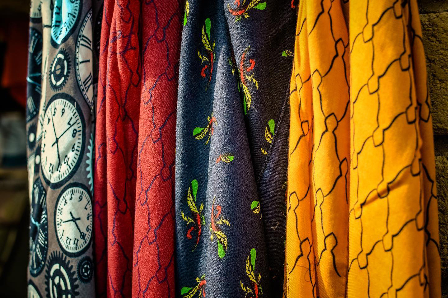
If you want to be truly elegant and trigger a chromatic harmony between jacket, shirt and tie, don't forget to wear a beautiful pocket square.Its origin is very ancient, the first evidence of not only functional but also ornamental use dates back to the ancient times Over the years it has had various evolutions and even in the Naples of the eighteenth century it distinguished the noble and wealthy men who used it to clean their mouth or nose from the plebeians who instead used to not use it and perform the same function with the sleeves of the shirt.
Today the pocket handkerchief has only an ornamental purpose and must be strictly white in cotton or linen for very institutional outfits or bright and colored in silk for more dandy and particular looks.
How to Match Colors According to Itten's Circle Theory

In this article we will explain what the Itten circle is and how it is constructed. It is a very important tool for understanding what the primary, secondary and complementary colors are. Let's start by introducing you to the inventor, Johannes Itten. He was a Swiss painter, writer and designer of the early 1900s. Johannes was an intense student of colors, so much so that he created a chromatic circle, the Itten circle, to represent pure (or fundamental) colors and their descendants from mixtures. Itten worked in a school of architecture, art and design that was very important for the art of the twentieth century, namely the Bauhaus.
Itten Chromatic Circle: Explanation
Itten, as we have already anticipated, is responsible for the classification of colors. On the basis of their aesthetic and communicative aspect, he divided them into: primary, secondary and tertiary.
As you can clearly see from the image, in the center of the circle there is a triangle that contains the three primary colors, which are red, yellow and blue. By mixing these colors, the secondary colors are obtained around the triangle to form a hexagon, and are green, orange and purple. Finally, it can be seen that the circle is closed with 12 colors which are the primary, secondary and tertiary colors, that is, the other colors that are obtained from further mixing.
By visually ordering the primary and secondary colors, the Itten circle shows the relationships between these colors, that is, it shows the colors that are obtained from the combination of the primary colors. The circle is divided into segments: the combination of colors found in the same segment of the chromatic disc generates a harmonious and balanced effect. Conversely, the combination of colors found on the opposite side of the chromatic disc (called complementary colors) determines a lively and lively effect, because the complementary colors light up and enhance each other.
To find complementary colors, Itten suggested that one had to choose a color and follow the diametrically opposite ones. These were his suggestions for finding the best color combinations. Obviously not everyone agreed with this solution and Itten was criticized for a long time. The main criticisms came because he did not consider the basic colors, namely black and white, which Itten defined as 'non-colors'.
How to Draw The Itten Circle
We thought we would give you an explanation on how to draw the Itten circle. In case you need help, here are our suggestions. First of all, provide yourself with: a compass; a pencil; a ruler; paints or colored pencils.
Then with the compass draw a circumference of the size you want. Paying attention to keep the compass with the same opening, you can now draw 2 dodecagons. Fix the metal tip on the circle and draw a mark on the latter. At this point you can continue by pointing the compass on the sign made previously in order to obtain another one in succession. Continue in this way to repeat the step described above until the points obtained are 6. At the end, with the help of the ruler, easily join the various points in sequence. You will then have obtained a regular hex.
How to Match Colors with Itten's Circle
Here is an interesting guide on how to match colors with the itten circle. The fundamental rule of the circle, as seen previously, is not to combine colors that are close to each other. In fact, the rule states that diametrically opposed ones must be combined: for example, yellow and purple, green and red. Still following Itten's theory, black and white, considered by the scholar of 'non-colors', can be combined with any color. To Itten's theory of colors, it is appropriate to add a few small tricks on color combinations.
It is advisable not to wear clothing that has similar colors, even if of different shades. It is advisable to choose the combination of similar patterns that have contrasting colors. According to Itten, one of the colors that can be combined with everything is black. It can be combined with both bright and subdued shades, except with browns and blues. According to Itten, another of the colors that can be combined with everything is white: defined as the only color that can look good with any color, with every shade from pastel to bold ones. Brown can be combined with warm colors or pastel shades. Blue can be combined with various shades of green or even according to some trends with shades such as red.
Itten's Theory of Color

Finally, before closing the article, we want to talk to you about Itten's theory of color and the study of the contrast between colors which is crucial for the Swiss painter. We talk about contrast when there are evident differences between two chromatic effects placed in comparison. If these differences are absolute, we speak of a contrast of opposites or a contrast of polarity.
Examples of these contrasts are represented by the effects: large-small; White black; cold-hot, which at their highest degree of opposition constitute an example of polarity contrast; By studying the most characteristic characters and chromatic effects, seven types of contrast can be established and they are: pure color contrast; quality contrast; chiaroscuro contrast; contrast of complementaries; contrast of cold and hot; quantity contrast; contrast of simultaneity.
If one of the biggest problems therefore remains that of choosing the best match for our garments, after reading this our in-depth analysis we are sure that you will no longer have future difficulties in matching colors and that some of you will have fun designing the circle of Itten by following our simple tips!
Products Fefè Napoli
Fefè Napoli
Sartorial is Better
When you wear a tailored garment, it will be the garment itself that will be able to adapt to your body.
History of Neapolitan Tailoring
Birth
Fefè was born in Naples in 2011 from an idea of Francesco Fossari and Serena Femiano, respectively lawyer and architect designer but with a common and boundless love for fashion, made in Italy and the excellence of Neapolitan tailoring. Francesco and Serena look at the market almost as a challenge and see the possibility of inserting an extremely simple but at the same time incredibly sophisticated product in the context of fashion: pocket squares of classic tradition but revisited in a modern key, revolutionized in style, in presentation, in essence.
Values
The exclusive prints, the essential centrality of a strictly Italian and artisan production, the use of only noble fabrics constitute the foundations on which the company and the ideals of its founders were based from the beginning. , the pulsating attention to every detail and customer requests have allowed the Neapolitan brand in a very short time to be distributed today in about 40 countries around the world, with over 500 retailers and with an online shop active since 2012 and with shipments to every corner. of the globe.
Sartorial is Better
Sartorial is better is the title of an advertising campaign of the brand, so loved by the founders that it became part of the brand in 2017.Literally it means: "tailoring is better" and in fact you just need to try a tailored garment, a garment born from hands of skilled craftsmen, to understand the substantial difference that exists compared to a product entirely conceived by a machine - typical of fast fashion.
The hand steps of a jacket, a shirt, a bathing suit or a sock, give the garment another fit, a comfort, a softness in the stitching that an industrial garment can never have. " When you wear a garment made entirely by machine, your body has to adapt, while when you wear a tailored garment it will be the garment itself that will be able to adapt to your body ".
Francesco Fossari - Co-Founder of Fefè - Forever Made in Italy
Made in Italy is not only a fixed point for Fefè but a boundless love, a philosophy of life that is the result of a centuries-old tradition, of an indelible passion for craftsmanship.The entire production cycle is born and ends in Italy and more particularly in Naples, where tailoring is almost a reason for living, a mission to be shared, a constant search for perfection mixed with a note of imperfection that only manual work can give. in a perfect balance between tradition and innovation, modernity and quality.
Tradition - Innovation - Italian Style - Fefè Worldwide
We are between the late 1800s and early 1900s. Naples is teeming with noblemen who flaunt elegance, refinement, good taste - the famous Neapolitan gaga -; the tailors and fabric merchants become their second homes. They talk about politics (monarchy or republic), about the developing economy, about women, about life and they usually call each other with a thousand nicknames and / or nicknames, among these the most widespread is Fefè.
Piazza dei Martiri, 53
In the heart of Neapolitan elegance and tailoring, in Piazza dei Martiri, Naples, the first Fefè store opens.
Stories of Neapolitan Fashion and Culture
A Timeless Classic
The ancestor of the present tie was a strip of cloth of various colors worn by the Roman legionaries. Its practical function was to protect the respiratory tract during the marches, in fact, especially the rearguard groups or those following the baggage or cavalry were afflicted by continuous clouds of dust raised by the often unpaved terrain. Like all fashion ornaments it begins with a specific function in everyday life but then over time it loses its functional aspect and gains ground in its ornamental role, acquiring beauty, color, preciousness. The origin of the Italian name is much discussed but it seems that it has a link with the Croatian soldiers who used it in their uniform in the 30 years war, arousing curiosity in the Italian people who obviously did not know what to call it. Today it is an object that cannot be ignored by those who want to be truly impeccable in terms of elegance and protocol. The width can vary between 4 and 9 cm, the length is always around one meter and fifty but the fabric must mainly be of the purest silk.
Curiosities About The Tie
An Italian senator cannot enter the Senate without a tie. To challenge this rule, Senator Speroni wore the most unthinkable ties: with drawings of pigs, leather Texan and so on. In the late 1990s, Thomas FinkeYong Mao, two researchers from Cambridge University's Cavendish Laboratory, demonstrated through mathematical models that there are exactly 85 possible knots for a conventional tie. In this way, new nodes were also discovered, one of which was renamed the "Fink node". The sale of ties has decreased particularly over the years. Once it was practically impossible to go to work without a tie, today it is used only by certain categories or in particularly elegant events.
An Indispensable Accessory for The Contemporary Gentleman
If you want to be truly elegant and trigger a chromatic harmony between jacket, shirt and tie, don't forget to wear a beautiful pocket square.Its origin is very ancient, the first evidence of not only functional but also ornamental use dates back to the ancient times Over the years it has had various evolutions and even in the Naples of the eighteenth century it distinguished the noble and wealthy men who used it to clean their mouth or nose from the plebeians who instead used to not use it and perform the same function with the sleeves of the shirt.
Today the pocket handkerchief has only an ornamental purpose and must be strictly white in cotton or linen for very institutional outfits or bright and colored in silk for more dandy and particular looks.
How to Match Colors According to Itten's Circle Theory
In this article we will explain what the Itten circle is and how it is constructed. It is a very important tool for understanding what the primary, secondary and complementary colors are. Let's start by introducing you to the inventor, Johannes Itten. He was a Swiss painter, writer and designer of the early 1900s. Johannes was an intense student of colors, so much so that he created a chromatic circle, the Itten circle, to represent pure (or fundamental) colors and their descendants from mixtures. Itten worked in a school of architecture, art and design that was very important for the art of the twentieth century, namely the Bauhaus.
Itten Chromatic Circle: Explanation
Itten, as we have already anticipated, is responsible for the classification of colors. On the basis of their aesthetic and communicative aspect, he divided them into: primary, secondary and tertiary.
As you can clearly see from the image, in the center of the circle there is a triangle that contains the three primary colors, which are red, yellow and blue. By mixing these colors, the secondary colors are obtained around the triangle to form a hexagon, and are green, orange and purple. Finally, it can be seen that the circle is closed with 12 colors which are the primary, secondary and tertiary colors, that is, the other colors that are obtained from further mixing.
By visually ordering the primary and secondary colors, the Itten circle shows the relationships between these colors, that is, it shows the colors that are obtained from the combination of the primary colors. The circle is divided into segments: the combination of colors found in the same segment of the chromatic disc generates a harmonious and balanced effect. Conversely, the combination of colors found on the opposite side of the chromatic disc (called complementary colors) determines a lively and lively effect, because the complementary colors light up and enhance each other.
To find complementary colors, Itten suggested that one had to choose a color and follow the diametrically opposite ones. These were his suggestions for finding the best color combinations. Obviously not everyone agreed with this solution and Itten was criticized for a long time. The main criticisms came because he did not consider the basic colors, namely black and white, which Itten defined as 'non-colors'.
How to Draw The Itten Circle
We thought we would give you an explanation on how to draw the Itten circle. In case you need help, here are our suggestions. First of all, provide yourself with: a compass; a pencil; a ruler; paints or colored pencils.
Then with the compass draw a circumference of the size you want. Paying attention to keep the compass with the same opening, you can now draw 2 dodecagons. Fix the metal tip on the circle and draw a mark on the latter. At this point you can continue by pointing the compass on the sign made previously in order to obtain another one in succession. Continue in this way to repeat the step described above until the points obtained are 6. At the end, with the help of the ruler, easily join the various points in sequence. You will then have obtained a regular hex.
How to Match Colors with Itten's Circle
Here is an interesting guide on how to match colors with the itten circle. The fundamental rule of the circle, as seen previously, is not to combine colors that are close to each other. In fact, the rule states that diametrically opposed ones must be combined: for example, yellow and purple, green and red. Still following Itten's theory, black and white, considered by the scholar of 'non-colors', can be combined with any color. To Itten's theory of colors, it is appropriate to add a few small tricks on color combinations.
It is advisable not to wear clothing that has similar colors, even if of different shades. It is advisable to choose the combination of similar patterns that have contrasting colors. According to Itten, one of the colors that can be combined with everything is black. It can be combined with both bright and subdued shades, except with browns and blues. According to Itten, another of the colors that can be combined with everything is white: defined as the only color that can look good with any color, with every shade from pastel to bold ones. Brown can be combined with warm colors or pastel shades. Blue can be combined with various shades of green or even according to some trends with shades such as red.
Itten's Theory of Color
Finally, before closing the article, we want to talk to you about Itten's theory of color and the study of the contrast between colors which is crucial for the Swiss painter. We talk about contrast when there are evident differences between two chromatic effects placed in comparison. If these differences are absolute, we speak of a contrast of opposites or a contrast of polarity.
Examples of these contrasts are represented by the effects: large-small; White black; cold-hot, which at their highest degree of opposition constitute an example of polarity contrast; By studying the most characteristic characters and chromatic effects, seven types of contrast can be established and they are: pure color contrast; quality contrast; chiaroscuro contrast; contrast of complementaries; contrast of cold and hot; quantity contrast; contrast of simultaneity.
If one of the biggest problems therefore remains that of choosing the best match for our garments, after reading this our in-depth analysis we are sure that you will no longer have future difficulties in matching colors and that some of you will have fun designing the circle of Itten by following our simple tips!
Products Fefè Napoli
-
 336,00 € In Stock
Fefè Napoli - Blue Velvet Lagaga Jacket - Jackets - Handmade in Italy -...
Narrow stripe velvet, striped with 0.3 cm symmetrical rib, unstructured by the warm, resistant, comfortable fabric. Classic lapel, two-button closure in mother of pearl. The cut is Neapolitan tailoring, perfect for the velvet purist in his most used and loved image. Ideal for the day and for business or leisure.
336,00 € -
 336,00 € In Stock
Fefè Napoli - Lagaga 'Camel Velvet Jacket - Jackets - Handmade in Italy -...
Narrow stripe velvet, striped with 0.3cm symmetrical rib, unstructured by the warm, resistant, comfortable fabric. Classic lapel, two-button closure in mother of pearl. The cut is Neapolitan tailoring, perfect for the velvet purist in his most used and loved image. Ideal for the day and for business or leisure.
336,00 € -
 336,00 € In Stock
Fefè Napoli - Blue Velvet Larocciatore Jacket - Jackets - Handmade in Italy -...
Velvet rib alternating from 0.3 to 0.5 cm. Warm, soft, comfortable, resistant fabric with an incredible ability to hold and refresh the light, creating an authentic play of chiaroscuro. 8cm lapel, two-button closure in mother-of-pearl, deconstructed. The cut is Neapolitan sartorial, perfect for those who love elegance but with a vintage and very refined...
336,00 € -
 336,00 € In Stock
Fefè Napoli - Green Velvet Larocciatore Jacket - Jackets - Handmade in Italy...
Velvet rib alternating from 0.3 to 0.5 cm. Warm, soft, comfortable, resistant fabric with an incredible ability to hold and refresh the light, creating an authentic play of chiaroscuro. 8cm lapel, two-button closure in mother-of-pearl, deconstructed. The cut is Neapolitan sartorial, perfect for those who love elegance but with a vintage and very refined...
336,00 € -
 336,00 € In Stock
Fefè Napoli - Larocciatore White Velvet Jacket - Jackets - Handmade in Italy...
Velvet rib alternating from 0.3 to 0.5 cm. Warm, soft, comfortable, resistant fabric with an incredible ability to hold and refresh the light, creating an authentic play of chiaroscuro. 8cm lapel, two-button closure in mother-of-pearl, deconstructed. The cut is Neapolitan sartorial, perfect for those who love elegance but with a vintage and very refined...
336,00 € -
 395,00 € In Stock
Fefè Napoli - Lacharmant Wool Gray Jacket - Jackets - Handmade in Italy -...
Zero Gravity deconstructed jacket in gray micro houndstooth by Vitale Barberis Canonico. Lightweight almost to give a feeling of absence of gravity thanks to its superfine 150g fabric. Napoli shoulder, 10cm classic lapels, two-button closure in mother-of-pearl. Ideal for more elegant occasions or for business, it can be safely used for less formal events...
395,00 € -
 364,00 € In Stock
Fefè Napoli - Laclubing Wool Blue Jacket - Jackets - Handmade in Italy -...
Knitted Jacket - This jacket is technically defined as a knitted jacket because it is obtained from the combination of tailoring and knitwear. The fabric used is a wool that is however woven and worked with the knitting system. The result is wonderful because you get the comfort and warmth of a sweater with the lines, proportions and elegance of a...
364,00 € -
 395,00 € In Stock
Fefè Napoli - Lanapoli Quadri Blue Black Jacket - Jackets - Handmade in Italy...
Knitted Jacket - This jacket is technically defined as a knitted jacket because it is obtained from the combination of tailoring and knitwear. The fabric used is a wool that is however woven and worked with the knitting system. The result is wonderful because you get the comfort and warmth of a sweater with the lines, proportions and elegance of a...
395,00 € -
 395,00 € In Stock
Fefè Napoli - Lacourmayer Blue Checked Jacket - Jackets - Handmade in Italy -...
Knitted Jacket - This jacket is technically defined as a knitted jacket because it is obtained from the combination of tailoring and knitwear. The fabric used is a wool that is however woven and worked with the knitting system. The result is wonderful because you get the comfort and warmth of a sweater with the lines, proportions and elegance of a...
395,00 € -
 370,00 € In Stock
Fefè Napoli - Lachiaia Wool Blue Jacket - Jackets - Handmade in Italy -...
Slim fit Neapolitan tailored jacket. Typically winter in wool, it features a natural and enveloping shoulder, side vents, notched lapels, patch pockets and two-button closure in mother-of-pearl. Perfect with a turtleneck, shirt or t-shirt.
370,00 € -
 370,00 € In Stock
Fefè Napoli - Lachiaia Wool Green Jacket - Jackets - Handmade in Italy -...
Slim fit Neapolitan tailored jacket. Typically winter in wool, it features a natural and enveloping shoulder, side vents, notched lapels, patch pockets and two-button closure in mother-of-pearl. Perfect with a turtleneck, shirt or t-shirt.
370,00 € -
 370,00 € In Stock
Fefè Napoli - Lachiaia Wool Tegola Jacket - Jackets - Handmade in Italy -...
Slim fit Neapolitan tailored jacket. Typically winter in wool, it features a natural and enveloping shoulder, side vents, notched lapels, patch pockets and two-button closure in mother-of-pearl. Perfect with a turtleneck, shirt or t-shirt.
370,00 € -
 378,00 € In Stock
Fefè Napoli - Field Jacket Sahara Fango - Jackets - Handmade in Italy -...
Wool flannel jacket. The inspiration comes from the English colonists who used this jacket to survive the severe temperature changes in Africa but at the same time have the comfort of a greater number of pockets. The fabric used is a 100% wool flannel that guarantees compactness, warmth, resistance, and elegance.
378,00 € -
 364,00 € In Stock
Fefè Napoli - Dark Blue Technical Trench Coat - Jackets - Handmade in Italy -...
Waterproof technical fabric trench coat this garment is based on the old military service coats in the trenches. Revisited in a modern and sartorial key, it reaches its maximum expression of elegance with a dress or in a more sporty key with jeans and a pair of sneakers. Button closure, quilted interior.
364,00 € -
 364,00 € In Stock
Fefè Napoli - Dark Blue Technical Parka - Jackets - Handmade in Italy -...
Parka in quilted waterproof technical fabric for a cult garment of men's fashion revisited in a sartorial and more elegant key. Ideal with the coldest temperatures but also perfect for more formal or business occasions. Closure with zip and buttons, quilted interior.
364,00 € -
 208,00 € In Stock
Fefè Napoli - Cambridge Blue Jersey - Knitwear - Handmade in Italy - Luxury...
Iconic sweater of American colleges and brotherhoods in 100% worsted merino wool, warm and of superior quality. Regular fit and V-neck.
208,00 € -
 208,00 € In Stock
Fefè Napoli - Cambridge White Jersey - Knitwear - Handmade in Italy - Luxury...
Iconic sweater of American colleges and brotherhoods in 100% worsted merino wool, warm and of superior quality. Regular fit and V-neck.
208,00 € -
 208,00 € In Stock
Fefè Napoli - Cambridge Grey Jersey - Knitwear - Handmade in Italy - Luxury...
Iconic sweater of American colleges and brotherhoods in 100% worsted merino wool, warm and of superior quality. Regular fit and V-neck.
208,00 € -
 120,00 € In Stock
Fefè Napoli - Burgundy Turtleneck Sweater - Knitwear - Handmade in Italy -...
Ultra-thin sweater, gauge 14, 100% merino wool, stone washed, ideal for under-jacket.
120,00 € -
 120,00 € In Stock
Fefè Napoli - Blue Turtleneck Sweater - Knitwear - Handmade in Italy - Luxury...
Ultra-thin sweater, gauge 14, 100% merino wool, stone washed, ideal for under-jacket.
120,00 €